zay-ui
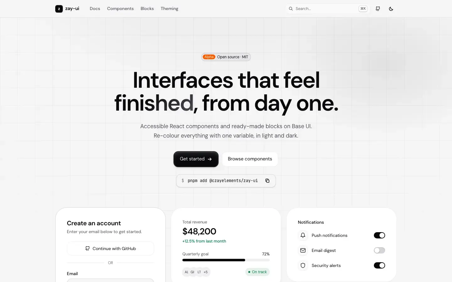
Accessible React components and ready-made blocks on Base UI. Re-colour everything with one CSS variable; works with or without Tailwind CSS v4.
- Year
- 2026
- Category
- Library
- Technologies
- 7
- Status
- In Development
Impact
Impact
- Components
- 47
- Blocks
- 18
- License
- MIT
About the project
Most UI kits either arrive with a heavy design language or leave accessibility to you. zay-ui sits between the two: behaviour and accessibility come from Base UI (focus management, keyboard, ARIA), while the look is built on neutral surfaces, hairline borders and a single accent colour. Change the accent with the `--hue` variable and the whole kit re-colours together, in light and dark. Alongside 47 components there are 18 ready-made blocks: full pages such as a landing page, dashboard, settings, sign-in and 404, and sections such as hero, pricing, FAQ and footer. This site runs on zay-ui itself. The package is an alpha: the API may change.
My role
I design and write the library: the visual language, the components, the blocks and the documentation site. I publish it to npm and maintain it.
Key features
- 47 components on Base UI: forms, overlays, navigation and data display
- 18 ready-made blocks: landing page, dashboard, settings, sign-in, pricing, FAQ and more
- Re-colour with one `--hue` variable, in light and dark
- Works with or without Tailwind CSS v4; styles live in CSS layers so your own CSS always wins
- A documentation site with live previews, copyable code and API tables
Community
Once the project was released as open source, contributions came in from the community. The list comes live from GitHub.
1 contributors · 12 contributions
Contributors
Contributors on GitHub
Next project
Better Payment
A unified payment gateway library that aggregates payment infrastructures and bank virtual POS systems in Turkey under a single API.
View project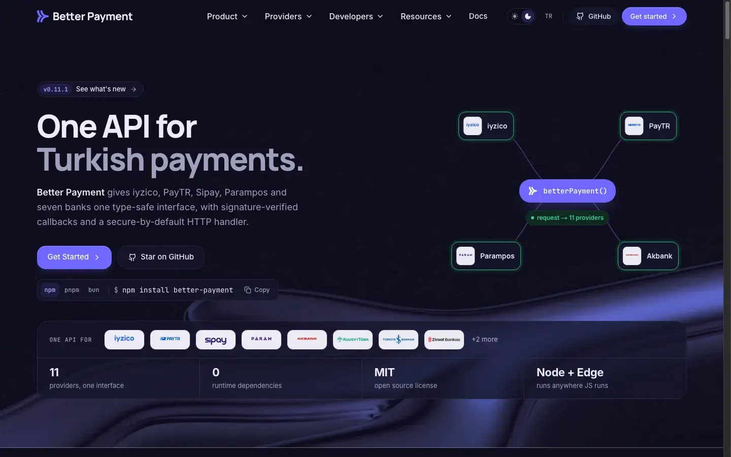
More work
All- Product2026Student PanelA private student platform for instructors and institutions. Curriculum, assignments, attendance, live classes, and progress tracking all in one panel; no public registration, students are added by the instructor.Live
- Library2026zaystaticA Git-based content panel for Next.js. Your content stays as plain files in your repository; editors change it in a panel and zaystatic commits straight to your branch. No database, no hosted service.In Development
Work together
Let's talk scope in writing.
I listen to the need first; if I think the job isn't a fit, I say so in the first call.